Hue
The colour family: red, yellow, blue and so on.
Choose a colour. Find a mix.
The colour family: red, yellow, blue and so on.
How light or dark it is. Different values help shapes stand apart.
How bright or muted it is. A quiet colour can make a bright one stand out.

Teacup ballet, 1935; printed 1991
Gelatin-silver photograph
Look at the pale saucers beside the long, dark shadows. Light and dark give ordinary cups shape and drama.
Art Gallery of South Australia, Adelaide. South Australian Government Grant 1991. Image: Saul Steed.
View artwork and source ↗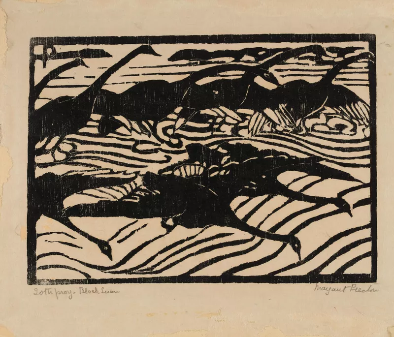
Black swans, Wallis Lake, New South Wales, 1923
Woodcut on paper
The dark swans stand out against the light paper. Just two main values can make a strong, clear pattern.
Art Gallery of South Australia, Adelaide. Bequest of Lisette Kohlhagen 1969. © Estate of Margaret Preston/Copyright Agency.
View artwork and source ↗
Wet sand, Anglesea, 1929
Oil on board
Notice the soft blue-greys beside the warmer orange cliff. Muted colours can still feel rich, especially beside a stronger colour.
Art Gallery of South Australia, Adelaide. Gift of Alastair Hunter OAM and the late Tom Hunter in memory of Elizabeth through the Art Gallery of South Australia Foundation 2019.
View artwork and source ↗
Music, 1927–28
Colour linocut on paper
The strong yellow figures stand out beside quieter green and grey areas. Compare their colour intensity with Beckett’s softer beach scene.
Art Gallery of South Australia, Adelaide. Elder Bequest Fund 1976.
View artwork and source ↗Reds, oranges and yellows usually feel warm. Blues and blue-greens usually feel cool. Compare them beside each other: one blue can feel warmer than another.
A tint adds white. A shade adds black. A tone usually adds grey. Watercolour gets lighter by adding water and letting white paper show through.
This is a traditional red–yellow–blue artist’s wheel, not a paint-mixing calculator. Pigments behave differently from screen colours.
Let one colour take up most of the space. Use another in smaller areas, and save your strongest contrast for the part you want people to notice.
Pick a colour. Use your warm and cool reds and yellows, plus blue, white and black.
Warm red leans towards orange; cool red leans towards pink or purple. Warm yellow leans towards orange; cool yellow leans towards green.
Try warm red + warm yellow for orange, cool yellow + blue for green, and cool red + blue for purple. These are starting choices, not guarantees: your blue and the strength of each paint still matter.
A “part” is the same-sized dab each time. These are rough starting mixes, not exact matches to the screen. Add the stronger colour slowly and test a small amount first. Use paints from the same medium.
For colour showing through gaps, try a small patch of a muted opposite underneath. A transparent layer over an opposite can become duller; a solid, opaque layer will hide it.
Basic paints vary. Your red, yellow and blue may make a softer or duller colour than the screen shows. Use a clean brush, add small amounts and check the mix after it dries.